
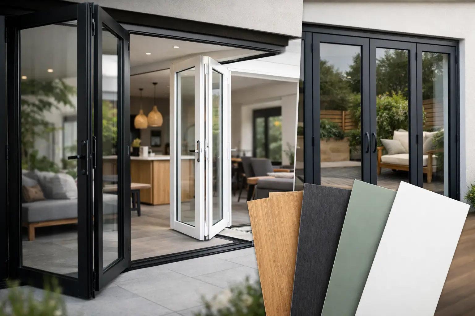
A bifold door can occupy an entire rear wall, so its frame colour has far more influence than a paint swatch suggests. The strongest bifold door colour trends are moving beyond a simple choice of grey or white, with homeowners using darker finishes, warmer metallic tones and carefully matched internal colours to give extensions a more considered finish. The right choice should suit the building, the light and the long-term look of the project, not just the latest image on a mood board.
The bifold door colour trends worth considering
Anthracite grey remains a popular choice for aluminium bifold doors, particularly on contemporary extensions. It gives a defined frame without the full contrast of black, works neatly with pale render, brick and stone, and is easy to coordinate with grey roof lights, windows and external steelwork. RAL 7016 is the shade many buyers have in mind, although it is worth confirming the exact finish and sheen rather than relying on a screen image.
Black continues to be specified where a sharper, more architectural result is required. Against white render or a light kitchen scheme, black aluminium frames make the opening feel deliberate and graphic. It can also suit period properties with traditional black-painted metalwork. The trade-off is that black is visually assertive. On a small or shaded elevation, heavy frames can feel more dominant than expected, especially when several panels are folded back and stacked at one side.
The most noticeable shift is towards warmer, less uniform colours. Bronze, dark brown, deep green and softer grey-beige shades are appearing on design-led renovations where anthracite feels too familiar. Bronze-style finishes work particularly well with timber cladding, warm brickwork and natural stone, bringing depth without the starkness of black. Dark green can be a strong option for rural homes and heritage-influenced projects, but it needs to be chosen with the surrounding materials in mind. A cool blue-green beside warm red brick can look less settled than it did on a sample board.
Textured and matt powder-coated finishes are also increasingly requested. They reduce glare, give the aluminium a more tactile appearance and can make darker colours look richer in changing daylight. This is not merely an aesthetic point. A quality powder-coated finish is designed for external use, but the maintenance routine still matters. Coastal locations, busy roads and exposed elevations benefit from regular cleaning to remove salt, grime and airborne deposits.
Why colour looks different on a door than on a sample
A small swatch cannot show how a colour will behave across a wide glazed opening. The amount of glass, orientation of the property and finish of the surrounding walls all affect the result. Anthracite grey can appear almost black on a north-facing elevation, while black can look softer in bright afternoon sunlight. Gloss levels matter too: a matt finish absorbs light, while a satin or gloss finish creates more reflection and makes marks more visible.
The panel layout changes the visual weight of the colour. A three-panel set of bifolds has fewer vertical lines than a five- or six-panel configuration, so a dark frame can feel less busy. Slimmer aluminium systems can help preserve the glass area, but sightlines, maximum sash sizes and panel weights vary between systems. Colour should therefore be discussed alongside the practical design of the door, rather than selected as the final decorative detail.
For example, a Smarts Visofold 1000 Bifold Door can provide a clean, versatile look for many extension projects, while a Schuco ASFD75 Bifold Door may suit buyers prioritising a premium engineered system and refined detailing. The best frame colour is one part of the specification, alongside glazing, threshold choice, handle finish and the number and direction of opening panels.
Match the frame to the whole glazing scheme
A consistent exterior is often more valuable than following a single-door trend. If the project includes aluminium windows, a sliding patio door, roof lantern or roof light, use the same colour family wherever possible. Matching bifolds to Smarts Alitherm 400 Windows or a Cortizo COR Vision Sliding Door can make separate openings read as one coherent architectural scheme.
Exact matching is preferable, but it is not always essential. Different products can have different profiles and surface textures, even when the nominal RAL number is the same. If a perfect match is impossible, a deliberate contrast can look better than two near-identical greys that clash in daylight. For instance, black bifolds paired with warm white windows can frame the main garden opening while keeping smaller side elevations visually lighter.
Inside, the decision is more personal. White internal frames remain practical because they sit quietly against pale walls, kitchens and ceilings. However, a darker internal colour can work beautifully when repeated in kitchen hardware, lighting, stair balustrades or steel-look partitions. Consider how the doors look when closed in winter, when they are likely to form a prominent part of the room for long periods.
Dual-colour bifolds offer a useful compromise
A dual-colour specification allows one finish externally and another internally. This can be particularly useful where planning expectations, a traditional façade or neighbouring properties point towards white outside, but the extension interior calls for anthracite, black or bronze. It is also a practical answer when the rear of the house is contemporary but the front elevation needs to remain sympathetic to its original character.
Dual colours can add cost and may affect available lead times, so they are best chosen early. They should also be specified consistently across adjacent windows and doors. A thoughtful dual-colour scheme looks intentional; a mix of unrelated finishes can make a high-value glazing package feel pieced together.
Choose a finish that will still suit the property in ten years
Trend-led colours are useful for inspiration, but bifold doors are a long-term investment. Neutral darks such as anthracite and black remain safe choices because they work with many future changes to landscaping, furniture and décor. Softer greys and bronze tones are equally enduring when they relate to permanent materials such as brick, zinc, stone or timber.
Bolder shades need more confidence. Deep green can look exceptional on a countryside renovation or a Victorian home with retained character, yet may restrict later exterior changes. Bright colours can be effective on a contemporary architect-designed build, but they usually demand a more disciplined palette throughout the project. For most homeowners, the goal is not to make the doors disappear. It is to make them feel appropriate from every angle.
Hardware deserves the same attention. Black handles on a black frame are an easy choice, while brushed stainless steel or a complementary metallic finish can introduce subtle contrast. Ask to see the handle against the chosen frame colour, especially with bronze and textured finishes. Details that look minor in a showroom can become noticeable at arm’s length every day.
Practical checks before finalising your colour
Request a physical colour sample and view it outdoors at different times of day. Hold it beside the actual brick, cladding, render or kitchen finish where possible. Computer-generated visuals and mobile phone screens are helpful, but they cannot reliably represent sheen, texture or the effect of natural light.
Check whether the selected colour is standard for the chosen bifold system or a special finish. Standard options can support quicker production and clearer pricing, while bespoke RAL colours offer greater freedom. A specialist supplier should also confirm that your configuration, glazing and hardware are all available with the proposed finish before manufacture begins.
For renovation projects, consider planning conditions and conservation requirements before committing to a dark or unusual frame colour. This is especially relevant where doors are visible from the street or form part of a listed or character property. A colour that is ideal for a modern rear extension may not be accepted on a prominent traditional façade.
Finally, do not let appearance distract from performance. Thermally broken aluminium profiles and energy-efficient glazing help a bifold door perform through British winters, while secure locking, appropriate glass specification and correctly managed installation protect the value of the investment. At Bifolding Door Factory, colour selection is best treated as part of the full specification, not an isolated finishing choice.
The most successful bifold door colour is the one that still looks right when the garden changes, the kitchen is redecorated and the initial trend has moved on. Start with the materials already fixed in the building, view real samples in natural light, and choose a finish that gives the opening the presence it deserves.